How to make your first graph in Flourish
Want to start creating your own data visualisations? Flourish is a great (mostly) free tool for turning your datasets into great looking graphs and charts. It's pretty simple to get…
Want to start creating your own data visualisations? Flourish is a great (mostly) free tool for turning your datasets into great looking graphs and charts. It's pretty simple to get…
Sometimes I get data requests that sound like they should be easy but turn out to have not much in the way of usable data available. What were the hottest…
The key to getting to grips with data journalism is remembering it is just like all other types of journalism... What is the story? In data journalism, the story isn’t…
PDFs are the never-ending bane of a data journalist's existence. Unfortunately, public bodies really love sending data as PDFs. https://twitter.com/dataeditor/status/1504142701213671430 As this is the case, you will often need to…
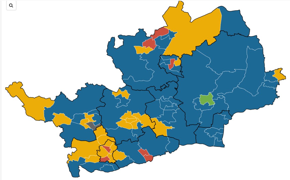
Thursday (May 5) is local election day, and the classic way of displaying results is in a map, coloured in to show which party won which ward. These are relatively…
The second edition of Getting Started with Data Journalism has just launched and over the next few weeks I'm going to be bringing you some beginners' guides to data journalism…