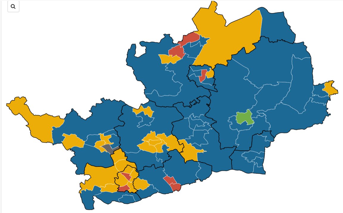
Thursday (May 5) is local election day, and the classic way of displaying results is in a map, coloured in to show which party won which ward.
These are relatively straightforward to put together using online data visualisation tools like Flourish and Datawrapper. Flourish is the slightly more flexible option here for uploading custom base maps to add your results to.
Want more? Buy Getting Started with Data Journalism, a beginners and beyond guide to finding, cleaning analysing and visualising data in any size newsroom.
One of the other benefits of Flourish is that when you update the underlying table, you can quickly re-publish the map based on it so it also updates, even when it is embedded in a webpage (in the paid for versions you can link to a CSV or Google sheet to make live updates).
This can be useful if you have data coming in real-time, which needs to be mapped or visualised as it becomes available, in order to give readers an up-to-date view on what is happening. So it’s great for election results, which start trickling in a few hours after polls close before building to a deluge as more and more votes are counted.
To make this kind of map work, there needs to be a lot of preparation work done before the night of the election. When the results start coming in, you want to be able to just add them to the map easily so people watching can see what is happening.
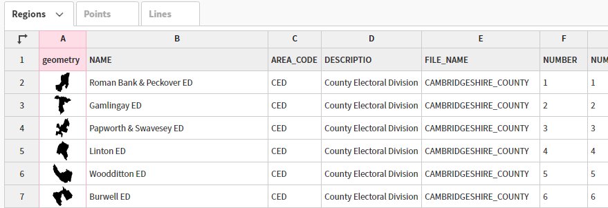
First you need to make sure you have boundary shapes for the electoral area you are planning to cover. You can download a GeoJSON for wards from the ONS Geography portal. You’ll need this to create the areas on your maps that you’ll then add data to.
The issue you may run into here is the most recent map boundaries are for December 2021, and some councils have new boundaries for May 2022. For example, Wales has reviewed all of the ward boundaries across the country, but the Boundary Commission for Wales has KML files for the new wards (the file marked as open in Google Earth). You’ll need to convert the file to a GeoJSON using Mapshaper (import the KML and then export as GeoJSON).
In Flourish, under Projection map in Choose a template, select Blank (upload you own GeoJSON). The first file you need to upload is the map, which you can do under the Data tab. You should be able to tell that the file has been recognised as a geographic one if you get a column with pictures of map boundaries in them. Flourish may have already labelled these as Geometry under the columns to visualise.
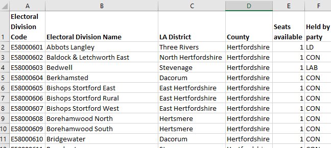
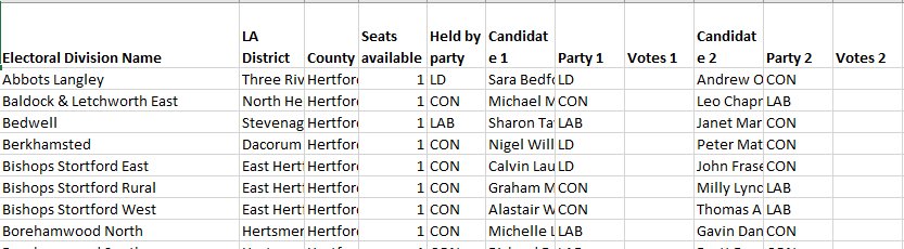
Next, start to create the spreadsheet of data that you will merge with your shapefile. You need to start with columns containing the area codes and names for the wards. If you do not already have this information saved, you can create it by downloading the a lookup file from the ONS, which will have names and codes, and, helpfully, the local authority the ward is in.
You’ll need the area code for the ward when you merge this spreadsheet with the geographic data already in your Flourish table (ward name isn’t enough as many wards have the same name despite being in different parts of the country).
Ideally, you’ll have the code for the ward when you merge this spreadsheet with the geographic data already in your Flourish table (ward name isn’t enough as many wards have the same name despite being in different parts of the country). If you have a file with just ward names, you may be able to solve this by merging in a look-up file first to the Flourish visualisation, so you can then filter the information down to the local authority, before you merge in your candidate etc. spreadsheet using the ward names.
Next, you need to decide what data you want to add to your spreadsheet. You can choose to do a lot or just add a little. You will likely want to start with the number of seats up for election in each ward or electoral division. You may also decide you want to add information on the party (or parties) that currently hold the seat.
You can find this information from council websites – either by looking at past election results or by looking at lists of current councillors.
When you are adding the information you need to keep all of the data on the same line as the code and name.
You may also want to add information about who is standing for election. Once the nominations are closed, this information is published, as the statement of persons nominated, by councils. However, this tends to be in individual PDF files. One way of accessing the information in a more useful format is via Democracy Club, which gathers up all the published information into much more usable formats.
There is a list of councils with the date of the elections
Clicking on a council will take you to a page with a list of all the wards up for election and all the candidates for each ward. There’s an option to download a CSV of this information (the site also has an API).
Once you have all your information about your upcoming elections in your spreadsheet, there’s several options for how you can use the dataset both before the election, on the night, and afterwards.
You can use this spreadsheet to create a map to show which candidates are standing in which seats ahead of the election.
To merge in spreadsheets to Flourish, in the Data tab, select the dropdown by Upload data and choose Upload data and merge. Then choose to upload your either the candidates spreadsheet or the look-up file. In both cases, you will need to match the two files using the ward code.
If you’re using the codes to merge in the candidate data for a single local authority, deselect the option to keep the rows that don’t have a match (as you won’t need them), and it will leave just the boundaries for that local authority with the matching candidate data. Otherwise, if you have to use the look-up file as an in-between stage, sort the matched local authority column, then delete the rows with local authorities you don’t need, and upload and merge in your candidates for the local authority left using the ward names.
Once you have your files merged, you can select the columns to visualise.
As well as adding numerical values to the Value section (in the right-hand side of the Data tab) to use to colour in your maps, you can also use columns with text – in this case the name of the party that holds the electoral division.
Flourish will automatically colour the areas categorically, i.e. all the areas held by the same party will be the same colour. You can use the custom overrides box to set specific colours for different parties in the Regions layer section in the Preview tab.
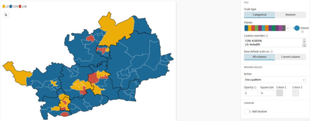
You can also edit the popup as you wish, using the custom option. This allows you to use the information columns dynamically – so you can include a list of candidates and parties for each seat. Remember to add the columns you want to include to the Metadata for popups section under the Data tab. If you want to add line breaks in your popup window, you may need to use </br>.
For example:
Held by: {{Held by}}<br>
<br>
<b>Candidates</b><br>
{{Candidate 1}}  {{Party 1}}<br>
{{Candidate 2}}  {{Party 2}}<br>
{{Candidate 3}}  {{Party 3}}<br>
{{Candidate 4}}  {{Party 4}}<br>
{{Candidate 5}}  {{Party 5}}<br>
{{Candidate 6}}  {{Party 6}}<br>
Once you’re happy with your map, you can publish it and embed it where you want.
For the results map, you can either use the same map but showing the new information, or you can make a duplicate from your projects page (where you arrive when you log in, or you can get back to it by clicking the home icon in the top left-hand corner). To do so, hover over the three dots on the visualisation and then select the copy icon.
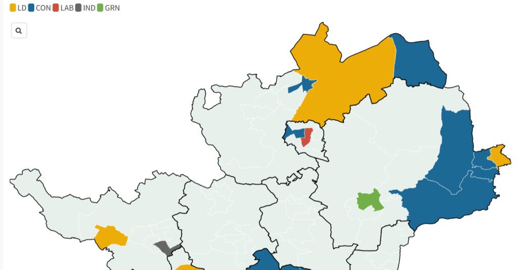
On your results map, you can add an extra column – either in Flourish or before you uploaded your spreadsheet – to put the party that wins the seat, as well as potentially adding columns next to each candidate to put the votes as they come in. On election night, you can switch the Value column from the party the seat was held by to the result.
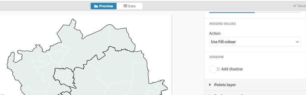
To start with you’ll have no values in that column. The default is to show the map with a hatched pattern for missing values, but you can change that to a neutral fill colour under Missing values in the Regions section in Preview.
As results come in, you can add the votes and then the name of the winning party to the empty columns. The areas will be coloured in using the colour scheme you set out before (you may need to add extra colours for any missing parties as you go).
For your results map, you can also change the information in the popup to include vote totals. Councils are usually pretty good at releasing information about who had won seats as votes are confirmed, most quickly update their sites and council Twitter accounts are a good source of up-to-date information.
As results come in and you add information, you can hit republish to publish the changes to your embedded maps.

Want more? Buy Getting Started with Data Journalism, a beginners and beyond guide to finding, cleaning analysing and visualising data in any size newsroom.