Want to start creating your own data visualisations?
Flourish is a great (mostly) free tool for turning your datasets into great looking graphs and charts. It’s pretty simple to get started – you can create your first data visualisation in minutes, but it’s also got potential for lots of customisation.
So how do you make your first line graph in Flourish?
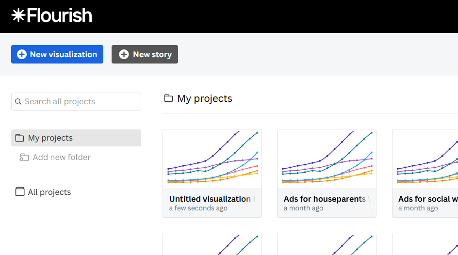
First you need to sign up for an account. Then on your projects page, pick New visualization.
There are loads of templates to choose from – pretty much every different kind of graph you can think of. Which one is best for your data will depend on the type of data and what you’re trying to show.
For example, if you want to compare the size of different categories a bar or column chart may be best. Line charts are better for tracking change over time. Pie charts (yes, even, occasionally, pie charts), can be used to show how parts make up a whole.
For this example, we’re going to make a line chart. So select that option from the list.
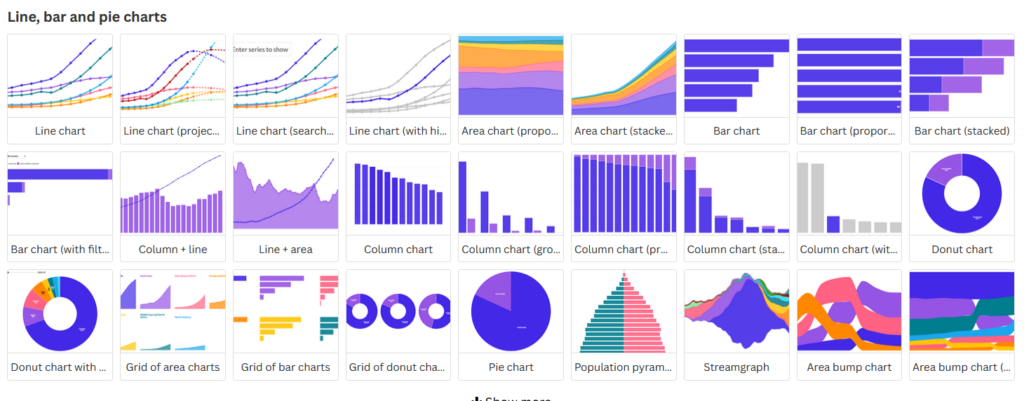
All of the graph and chart templates have sample data. Which is really helpful for seeing what the data visualisation will look like. It also gives you an idea of the type of data needed to make each graph.
Want to start learning the techniques for data journalism, or give the skills you have a boost. Getting Started with Data Journalism is packed with data journalism tips and tutorials.
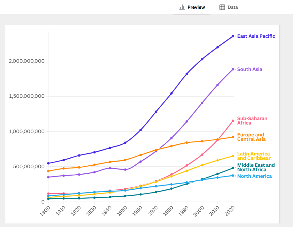
To see the data behind the graph, and add your own, click on the Data option above the graph preview.
There’s a couple of ways to get your data into your Flourish graph. You can paste it straight into the table by using CTRL+P. Or you can click the Upload data button in the column on the right and upload an Excel spreadsheet or a CSV.
If you’re pasting in data, you’ll need to delete the sample data. Uploading data will give you the option to replace the data already in the table.
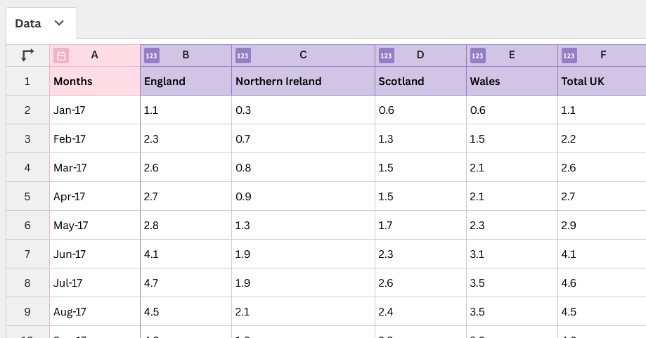
There’s an icon next to each of the column letters indicating the kind of data in the table. So month is a date or time and the other columns contain numbers.
This is automatically generated based on what’s in the column, but you can click on an icon to change the type if needed. So you can indicate a column that mostly has numbers but contains text to indicate N/A for example is actually a column of numbers rather than text.
You’ll see that the columns are highlighted in different colours. This is because they are powering different parts of your graph. You can adjust that in the panel on the right.
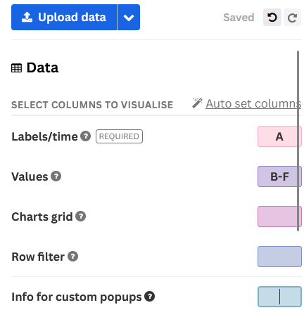
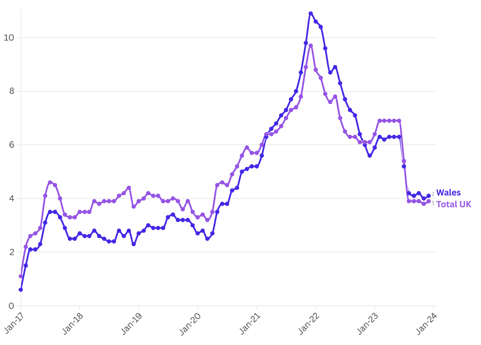
A line graph needs a column with time periods as well as one or more columns with values. You can see how the colours match the columns in the table. You can change which ones are shown by changing the letters in the boxes.
Once you have the data you want on the graph, switch back to the Preview screen to see how it looks and edit it.
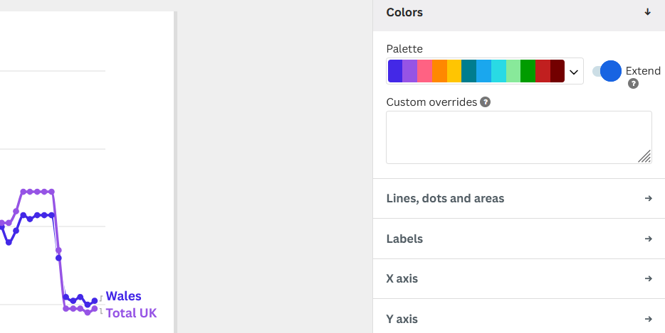
The panel on the right gives you lots of options for customising the look of your graph. Firstly, the colours are too similar. You can change them by selecting a different palette. Or you can edit or create your own by selecting the Edit color palette option.
Graphs need labels (it helps people better understand what’s going on with the data).
It’s best practice to label lines on line graphs (as Flourish does by default) rather than having a legend as it’s easier to see what each line represents (rather than having to match colours to a legend).
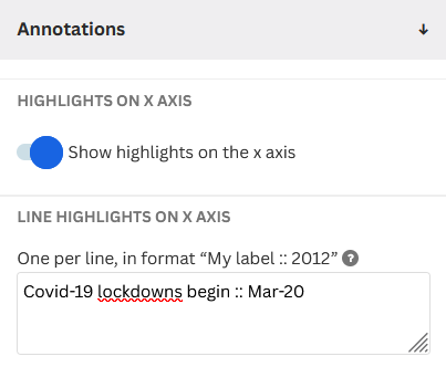
You may want to label the two axis. Annotations can also be useful to add context to your data.
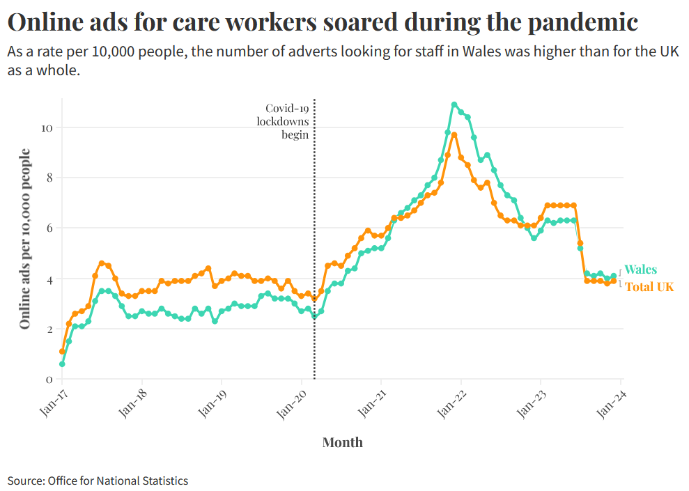
You can add annotations by adding the text you want to show next to the point on the axis (represented by the value in your dataset) where you want it to show. So here indicating the start of pandemic restrictions next at March 2020.
You can also add headers (to explain what your graph is about) and subheadings as well as footers to link to the source of your data and add any notes you need.
You can also change fonts in order to customise the look and feel of your graph.
As you can see, Flourish is quick and easy to get started with but flexible enough that you can create many different types of graph customised to look great!